Marketing is one of the toughest jobs of an author. And it's not usually one we enjoy. We're reclusive creatures and that does not mesh with being promotional gurus.
But we want to share our work with the world. One of the best ways to do so is with book ads. Maybe it's just the image of your cover with your tagline or a picture of you on your knees begging readers to buy your book. Whatever you choose to do, here are five tips for creating ads.
1) Know your audience. This means not only knowing your genre, but where your work fits in that genre. Dark, mysterious, funny? What is the theme or mood you wish to portray? What do your readers like best about your book? If it's that weird little robot sidekick, find a picture to represent it and shine the spotlight on it.
2) Make certain the font is readable. I encourage playing around with different fonts and effects, but so many times I've run across ads I couldn't read because of the font. Yes, the fancy swirls are nifty and the reflecting light looks cool, but if I can't read the ad, I won't want to read your book.
3) Images. Yes, many people suggest that displaying your book cover is essential in an ad, but I disagree. You can find images to represent different characters or scenes or a magical item. (Always make certain you have permission to use those images!) You could make your ad look like a movie poster.
4) The message. There isn't a lot of room to explain all the reasons someone should buy your book. So what can you say? Use a clever tagline or a snippet of a great review. Even a line from the story itself can work.
5) Once you've put it all together, DO NOT forget to link it to your book's buy link. Your website is okay, but if the person is interested enough to click on the ad, you want to take them to where they can buy the book immediately.
Do you have any book ad tips to share? What captures your attention when seeing an ad?
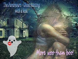
Here are a few examples of my latest ads!


Hi Christine - good tips -and I agree being able to read the ad is critical - as too the colour ... love these you've created .. cheers Hilary
ReplyDeleteThanks, Hilary!
DeleteClever - and fun. And yes, enticing too.
ReplyDeleteThank you, EC!
DeleteI've never made one. (Missed that boat, didn't I?) Yes, legible please!
ReplyDeleteYou could have one of your clones make one. ;)
Delete#1 is my stumbling block - I still don't fully know where I fit in. I just tell the story that's in my head. I'll have to figure that out at some point, I guess :-) Good tips.
ReplyDeleteThanks, Annalisa. It's tough with short stories, but perhaps you could pick one in the collection and gear the ad in that way.
DeleteGreat ads, Christine! I love the little icons you did of the ghost with a kiss and the dice with a kiss. Very clever and effective.
ReplyDeleteThanks, Mary! Some logos are easier to come up with than others.
DeleteThat last tip is essential! I've seen not only book ads, but books in the sidebars of sites that don't link to anything.
ReplyDeleteThat's just crazy! Authors should want to bring people to where they can buy their books.
DeleteGreat tips, Christine. I love swirly fonts, but never use them because they are hard to read.
ReplyDeleteThanks, Patricia! I'm fond of the swirly ones too, and every time I try to pick out a readable one, I always go to Courier. I'm so predictable!
DeleteThe choice of font is really important. I've seen book covers and adds with fonts that are super hard to read when they're sized down to a thumbnail.
ReplyDeleteI totally agree. I'm currently trying to find the right font for the book covers of my next series, and it's tough. I want something that stands out and yet it has to be readable in thumbnail size.
DeleteThose are great tips. After you make the ads, where do put them?
ReplyDeleteThank you, Sherry! I use them on Facebook and Twitter and in my newsletter. Author friends sometimes put them on their blogs or in their newsletters.
DeleteThanks, Christine! Twitter is probably a really good place for them.
DeleteI like the ones you created for your books. #2 is key. If a person can't read it, then what's the point?
ReplyDeleteThanks so much, Cherie! Fonts I struggle a little with. I like them readable, but I need help in picking the right mood ones! ;)
DeleteGreat tips! I'll file these away for later.
ReplyDeleteThanks, Tabatha! :)
DeleteMy favourite: geeks are sexy. I wish someone had told me that when I was 20. Great tips.
ReplyDeleteThank you, Joylene! I feel the same way. :)
DeleteLove the ads! And thanks for the great advice! :)
ReplyDeleteThanks so much, Jemi!
DeleteNice ads! I haven't created anything really interesting that way, but one of these days, maybe I will make the time to do it. :)
ReplyDeleteThanks for the tips!
Thanks, Tyrean. My photoshop skills are pretty basic. So I think you could do it! :)
DeleteThese are all fabulous ads and I agree with your tips on creating great promos. Images are KEY.
ReplyDeleteThank you, Catherine!
DeleteInteresting tips! I'm slowly trying to wrap my head around book ads, but I haven't figured out which direction I want to take yet.
ReplyDeleteThanks, Misha. It's tough trying to figure out what to do. I went a few different ways before I came out with these ads.
DeleteGreat tips! I'm terribly slackerish when it comes to creating ads for my own work, but I've drawn some for others before. I couldn't agree with you more about fonts! I'm always paranoid about legibility and will scale down an ad as I'm working on it to make sure the font isn't too small. The color scheme of an ad is important, too, I think, since it can affect the overall feel, and even help with building a cohesive brand...
ReplyDeleteThanks, Heather. You do have an artist's eye, so you know very well all those details. :)
Delete